Decoding Mobile Shopping: Future and Best Practices
It has been more than two decades since the term ‘M-commerce’ first came into existence and since then it has come a long way. According to studies, only a small number of people liked to shop via their mobile phones until the first half of 2015 but, thanks to the newest technology and features (not to mention exclusive mobile app discounts and convenience), mobile commerce has risen significantly. From being just a small gadget to make emergency calls to the smartphones of today, mobile phones have become a necessity in modern life. Today we’re talking about mobile shopping best-practices, synergy with brick-and-mortar, and the future of M-commerce.
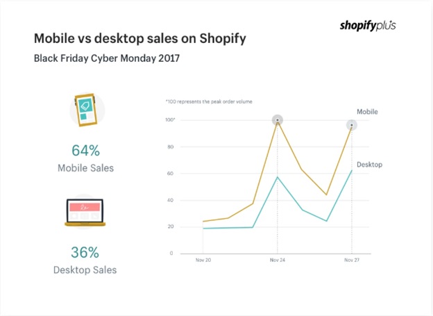 Image Credits: Shopify
The above image represents the trend of mobile shopping when compared to desktop shopping. In this article we will be going through the best practices to design your website to keep up with the mobile market.
- Responsive Design ≠ Mobile Design
According to a thesis by Shanelle Mullin, the concept of responsive design goes beyond just ‘pinch and zoom,’ this is a common misconception. While responsive design was initially designed with mobile phones in mind, it doesn’t necessarily limit or restrict functionalities to mobile devices only. In the bigger picture, it should be the needs of the mobile user that needs to be accommodated for, as well as that of a desktop user, and the tablet user, and just … the user. Isn’t that the entire concept of UX?
While it is easy for management to get seduced by rising mobile trends because of their designs, features, and specifications that enhance the shopping experience on a mobile device; it is crucial to understand that the real difference lies in proven optimization tactics rather than visual gimmicks. Looking closely into Inflow’s Best in Class eCommerce Mobile Report, you can see that almost all the leading mobile retailers follow a series of Do’s and Don’ts. Here’s a few of them:
- Avoiding Hero Image Sliders

GIF Credits: Shopify
Building seamless and memorable experiences isn’t an easy task. The secret lies in knowing what to include and most importantly, what to exclude. While there was once a huge interest in hero image sliders, nowadays it’s a bad call. None of the pages in Nike’s 2019 app use any hero sliders despite having an elaborate product catalog and changing sales updates. It’s a well-thought-out decision not to include overwhelming sliders, as it will ruin the dynamic feel of a site.
- Using Fixed Navigation Bar at the Top
Customers should be able to easily locate the right icon to find the category details and menu on the app. In order to keep it both visually impressive and easy to navigate, the app should have a fixed top menu bar and as few floating options as possible.
- Social Media = People Looking = People Buying
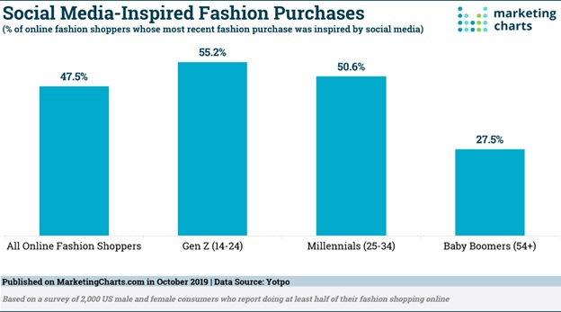
This report by Forrester Data estimates that 53% of purchases across the world are influenced by social media. The more people see a product, the more people are interested in it. This leads to shoppers looking for website/app-like purchase experiences in brick and mortar stores—they look for product information, ratings and reviews as well as the best available price. Sometimes, people prefer to pay instantly online rather than standing in long queues. This ease is a big part of why mobile shopping and e-commerce took off.
According to Mary Meeker, an American venture capitalist, an average adult spends 5.9 hours on their phone per day, often scrolling feeds on social media or working on something. It is during these times that your product needs to be discoverable on social media. Investing in the right advertising and promotion strategies can lead to organic traffic generation and possible conversions.
- More Channels ∝ More Value
While it may sound strange to believe at first, sometimes even an average mobile eCommerce experience can make your customers abstain from making a purchase even when they are shopping at a physical store! According to research by Harvard Business Review on 46,000 shoppers, it was found that more than 73% of shoppers coursed through various channels as they were making the purchase. Such customers are extremely valuable as they are hard to please, slow to leave and quick to notice best offers. These customers use an interactive catalog at the physical store, compare prices online, download a coupon or simply do the research to leave and come back later for the purchase.
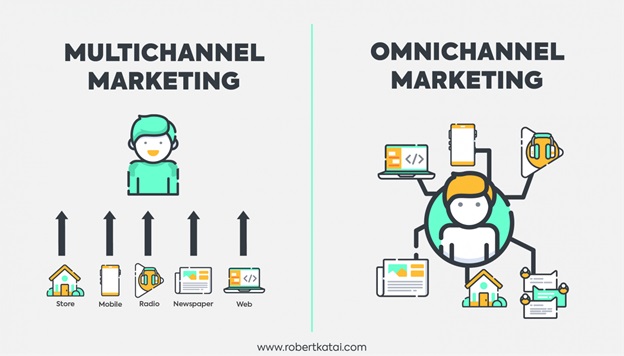
In the case of online buyers, it was observed that 60% of shoppers actually do window shopping on one device and make a purchase on a different one.
Thanks to the advent of quick and handy mobile wallets, the payment methods available are more than enough to help you skip long queues of a physical store. Such entwined worlds of mobile and retail have led big players like Amazon to switch to the Amazon Go Store across the US where one needs a phone to use the store. The product that you choose can be scanned by your phone for a Prime membership discount and pay later via your app. It’s that easy!
Going across all channels may not be easier on the budget as well as on the road at first, but know that it will all pay off in bigger returns. Thanks to the rising figures of online shoppers, people are sure to crossover various boundaries to finally make the purchase. Omni-channel marketing is the touchdown of all conversions and sales.
- Native Checkout Payments = Less is More
First-hand experience shows that it is often the final checkout period that makes the customer swoon or sends them away for good. Checkout abandonment is a huge problem for retailers, and it’s important that you get this stage right. There are four fundamentals that a checkout page must contain: fewer clicks, fewer screens, fewer fields, and fewer taps. Refining these processes can save you from a lot of incomplete orders and bounce rates in the long run. Now having mobile-first payment methods doesn’t mean you can easily skip traditional logins and credit cards, rather it means having a dynamic checkout process on your app. The benefits of installing dynamic checkout button are:
- Accelerating mobile conversions by lessening the number of steps
- Custom made checkout options and preferred payment methods
The types of instant payment methods included in the dynamic checkout process are PayPal, GooglePay, ApplePay.
Conclusion:
In our modern, fast-paced lives, it’s quite a luxury to have mobile-first, accessible, eCommerce experiences—we’re all busy, we’re all tired, and going to the store is hard. When shopping online is so easy and streamlined, physical stores struggle to compete. When mobile commerce first started to provide big time competition to brick-and-mortar stores, there were smart retailers who have turned the tables again to stay in profit. Leveraging cost-effective ways to discover practical solutions goes a long way in building and sustaining brand loyalty. With all the research, trends and innovations that are going on currently in mobile commerce, M-commerce will only become more prevalent.

